SS&C Blue Prism
Infographic
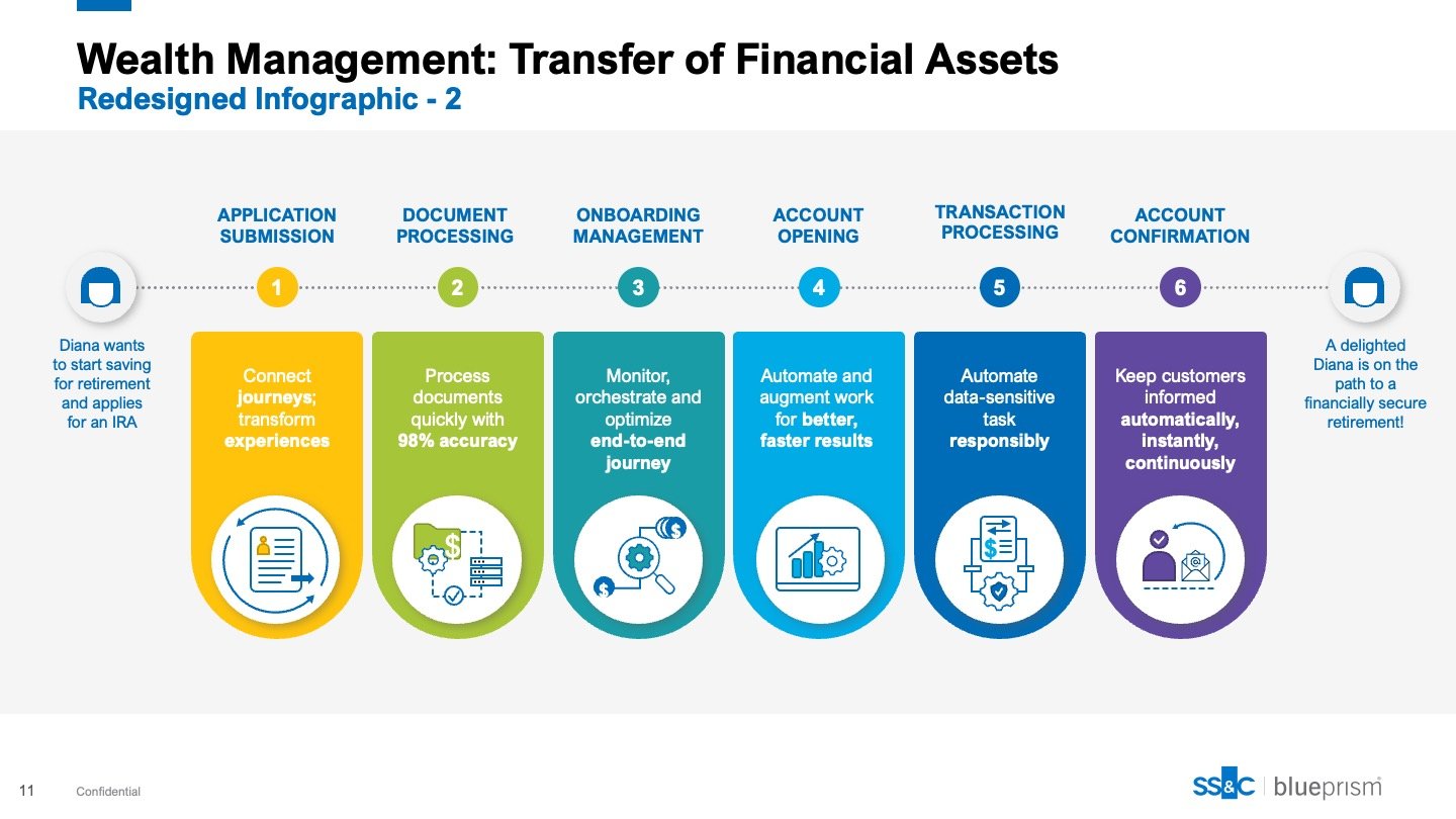
Redesign of the infographic.
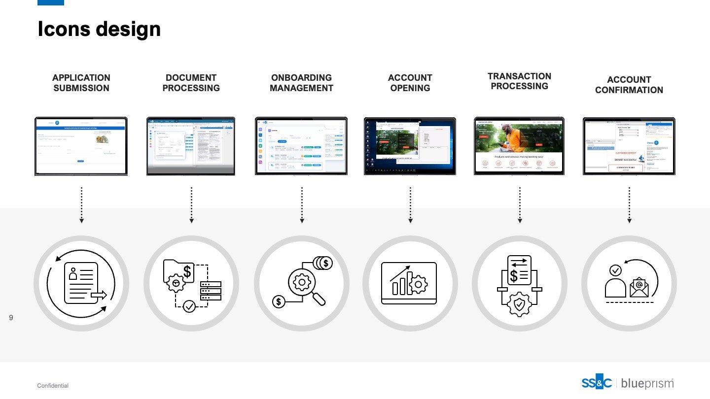
The goal was to create a more visually engaging, easy-to-read, and straightforward graphic. I began by designing icons and visuals to represent each step of the infographic, replacing the cluttered and hard-to-read screenshots. Once the graphics were complete, I applied a gradient of colors, in line with the branding, to guide viewers through each step, adding interest and making the design more appealing. All graphics are vector-based and fully editable in PowerPoint, making the asset versatile and adaptable.


