

Uchi Cha 茶
Branding
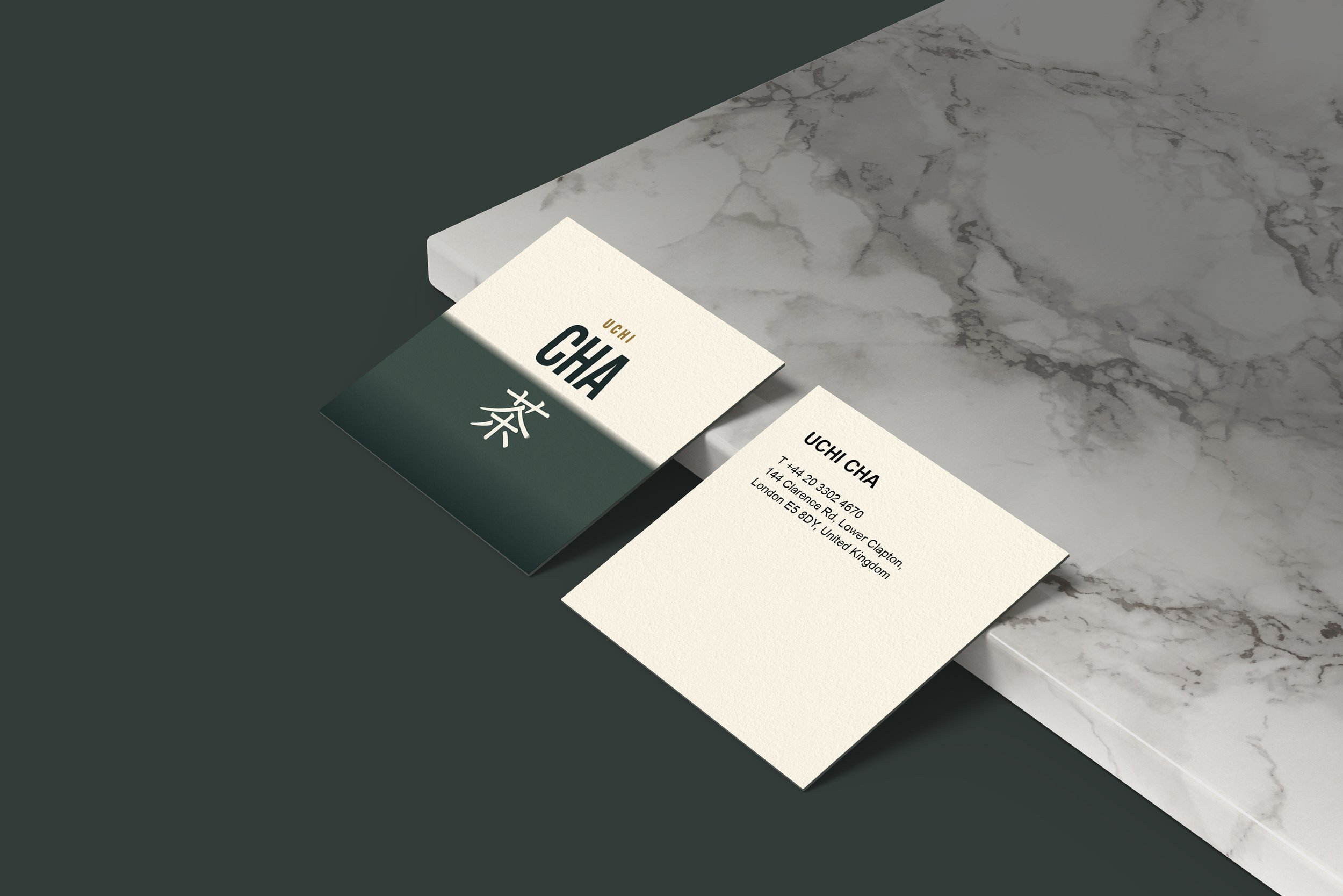
Uchi Cha 茶 crafts fresh Japanese cakes, sandwiches, and biscuits daily, in a welcoming space in East London.
Uchi Cha, a Japanese cafe and tea house, emerged after the success of restaurants Men and Uchi. While crafting the brand identity, it was crucial to harmonize graphic elements, visually connecting all establishments while preserving their distinct identities.


Heading Now Trial


Acumin Variable Concept
The Uchi Cha logo seamlessly merges the boldness of the original UCHI restaurant logo on one side, while retaining the modern and cleaner touch of MEN on the other side. The focal point is the word CHA (Tea) and the kanji symbolizing the tea house. UCHI is positioned smaller at the top, serving as a reminder that both businesses will coexist within the same shared space.

凸版文久明朝 レギュラー

the background incorporates a gradient, diverging from the solid (straight and curved split backgrounds) of previous restaurants. This serves as a subtle reminder that CHA is a fusion that seamlessly blends both identities.


